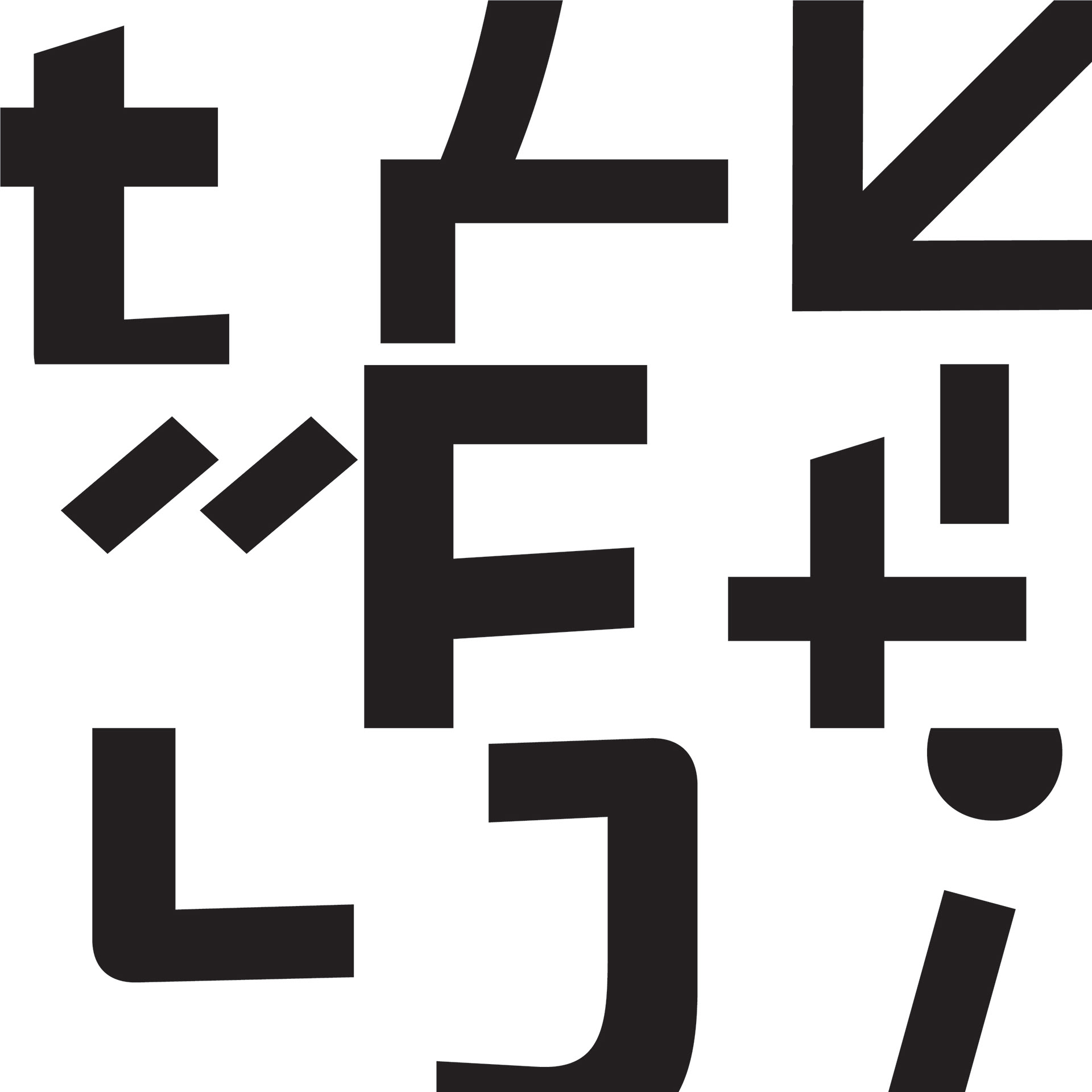
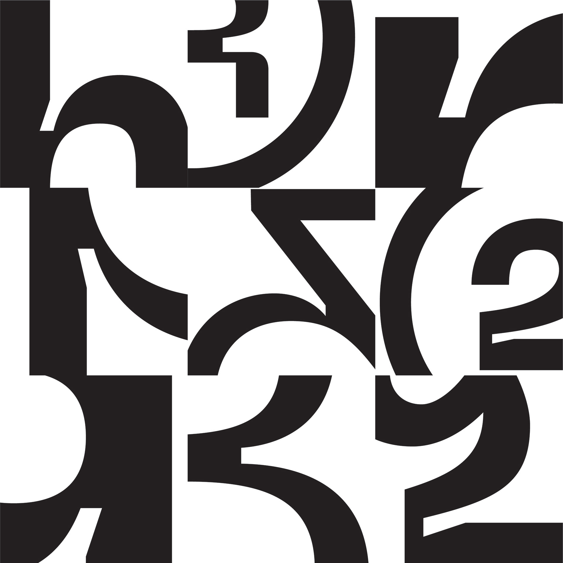
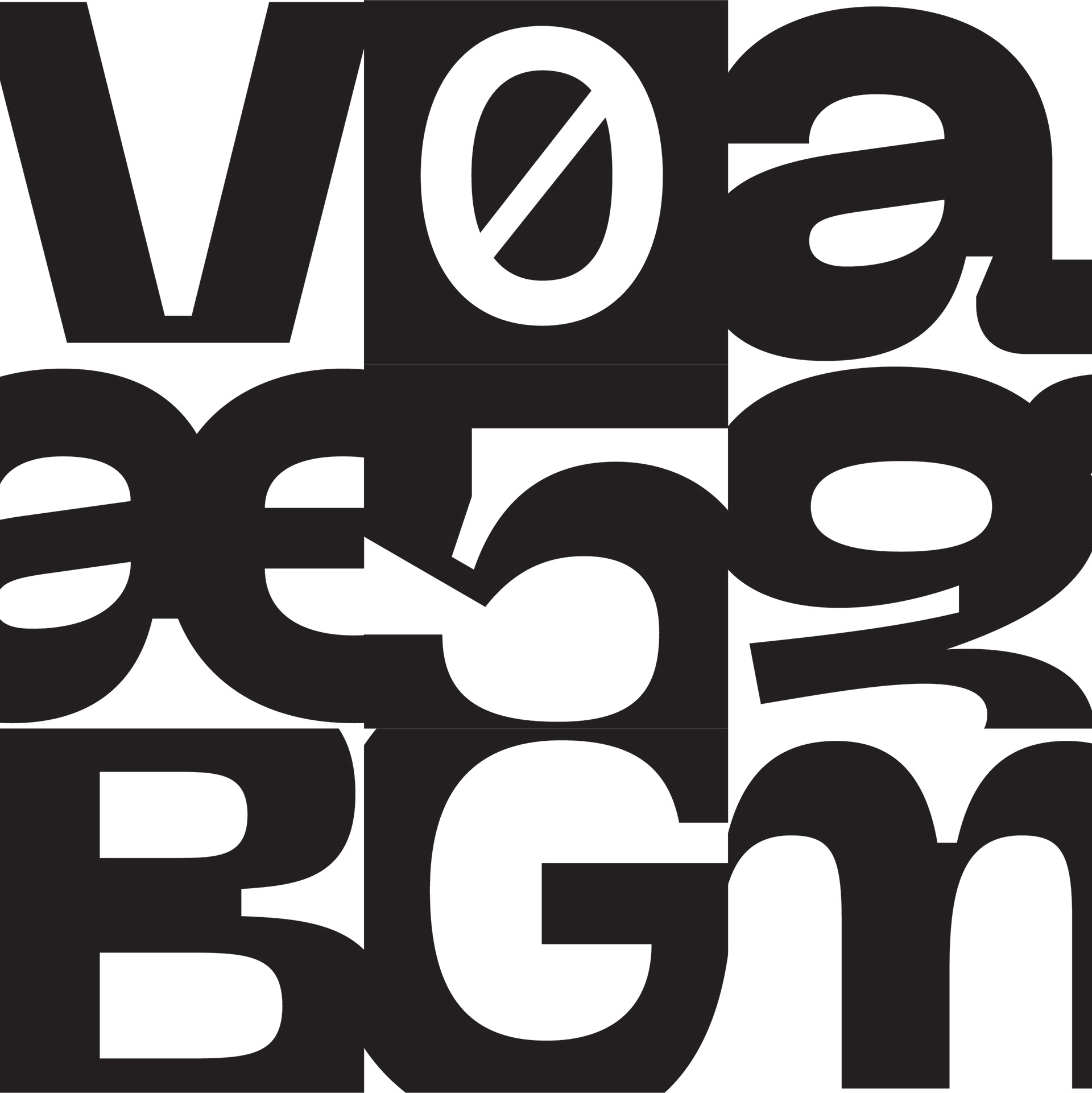
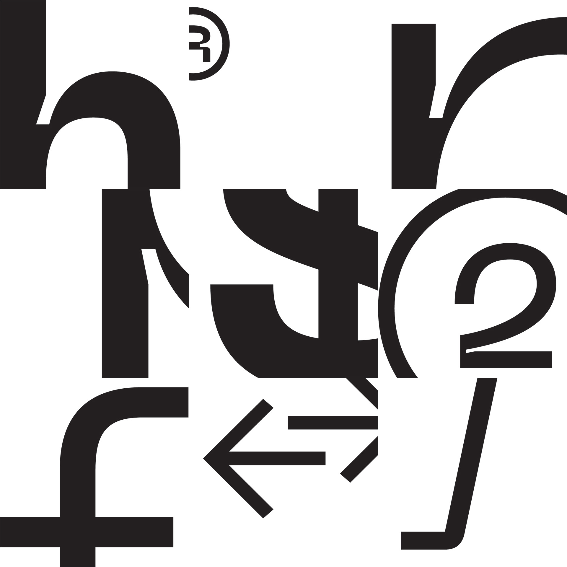

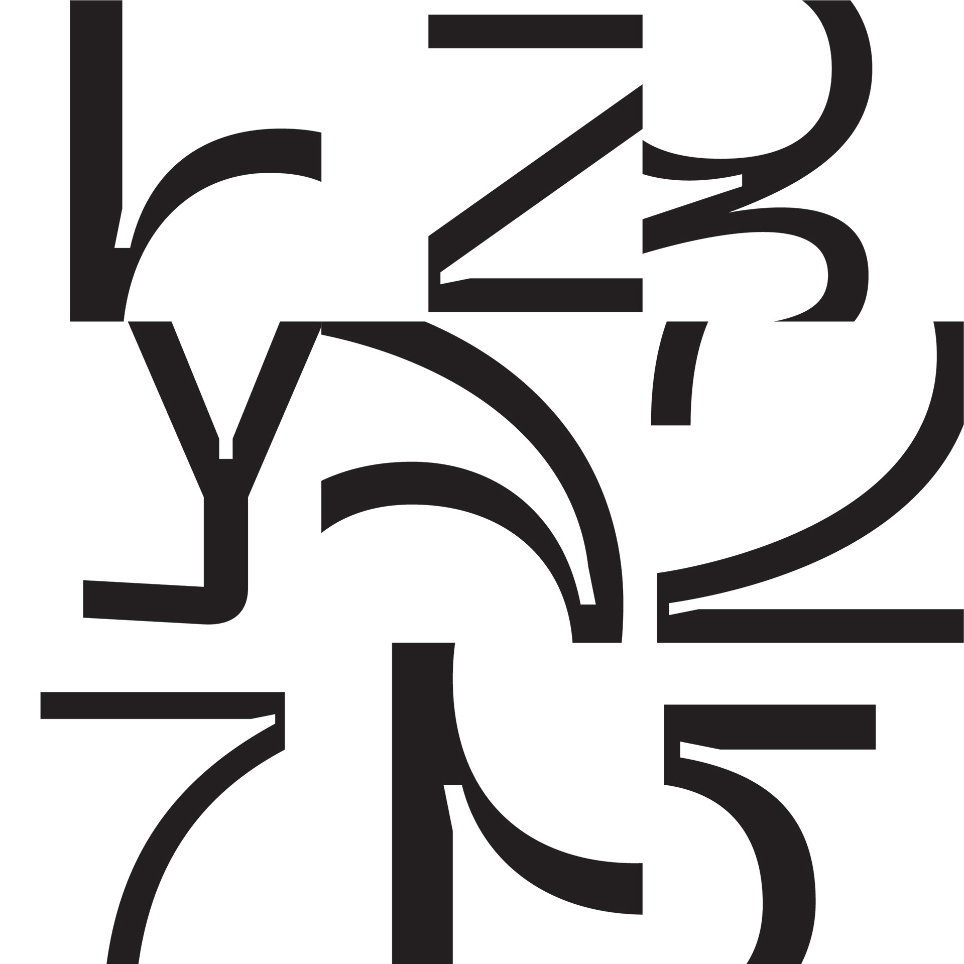
Neue Machina is a collaboration between foundry Pangram Pangram and visual designer Vasjen Katro/Baugasm. It is described by its designers as a typeface for the future, inspired by the aesthetics of robotics and machines. It can function both as a display and text font, coming in seven different weights ranging from Ultralight to Black. Neue Machina inspires dreams of science fiction and cyberpunk darkness. Designed in April 2019, this typeface is reminiscent of the New Wave of science fiction stemming from classic sci-fi authors of the 50s and 60s. These authors examined themes of drug culture, sexual revolution, corporate control over art and culture, and technology. Neue Machina weaves a delicate dance between human and machine - it has beautiful soft curves juxtaposed against sharp, clean lines. Like a replicant from Blade Runner, Neue Machina is a sharp machine that yet dreams of softness. Cyberpunk and most science fiction subcultures has roots firmly planted in the Postmodern movement; therefore, one may argue that Neue Machina could be described as a Postmodernist typeface. In literature, postmodernism generally contains themes of playfulness, genre-bending, and denial of neat aesthetic or moral wrap-up, with a skepticism towards grand narratives. Postmoderism threw moderism rules out the window while holding the door for new (technological) aesthetics. Neue Machina resembles a monospaced typeface, once again harkening back to the integration of type and machine. Certain characters are sans serif, while others have an overshot serif or slab attached. The tails, spurs, and terminals are all incredibly unique in that they feature deep ink tracks that are especially visible in the heavier weights. Certain characters such as M, N, W, and Z are “chopped”, for lack of a better word, which only heightens the robotic feeling.
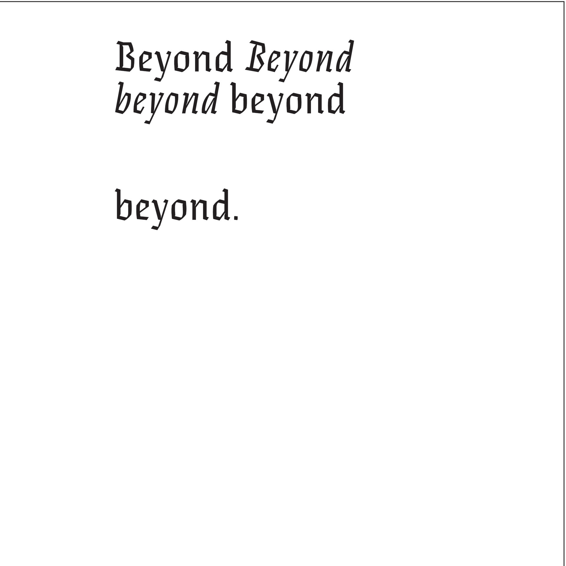


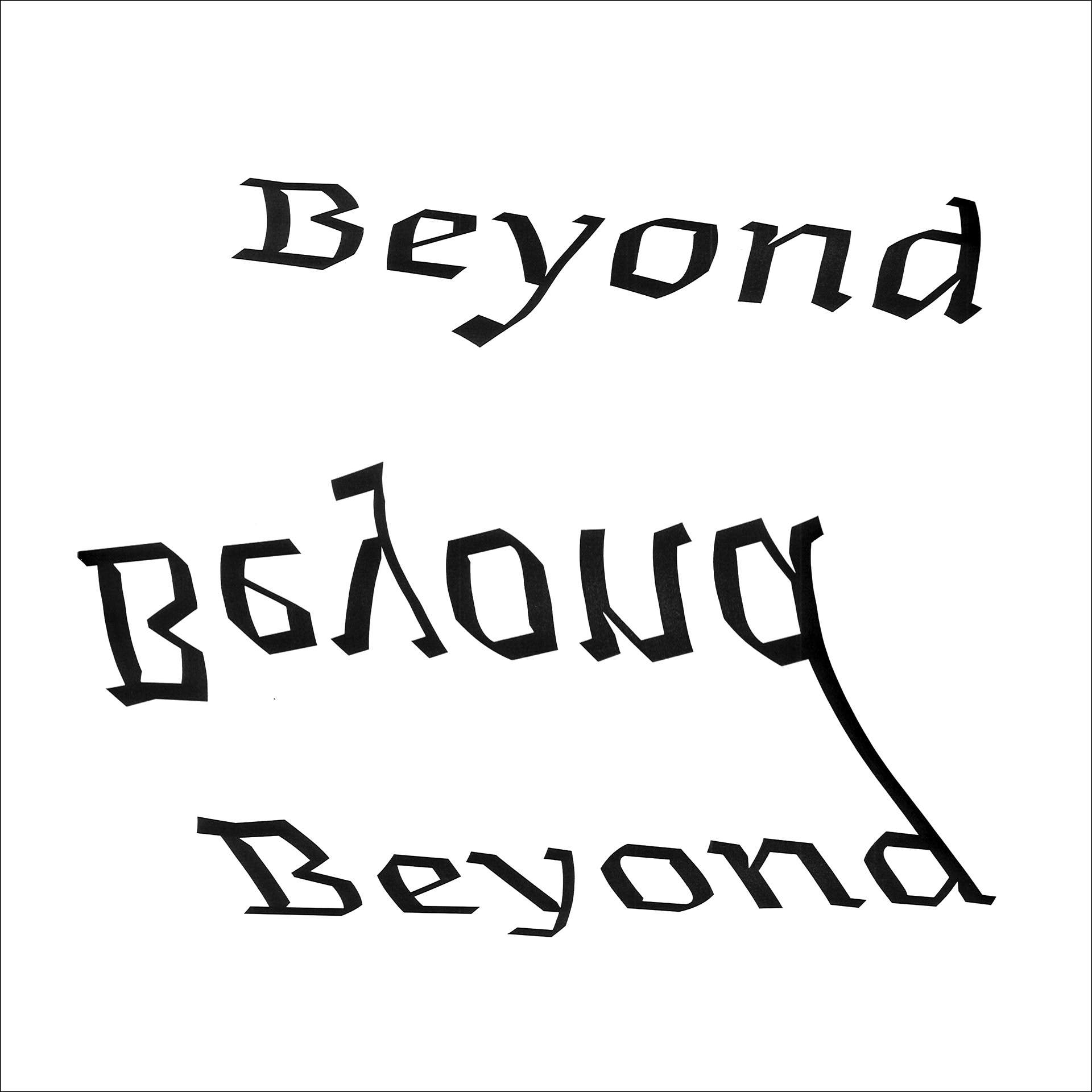
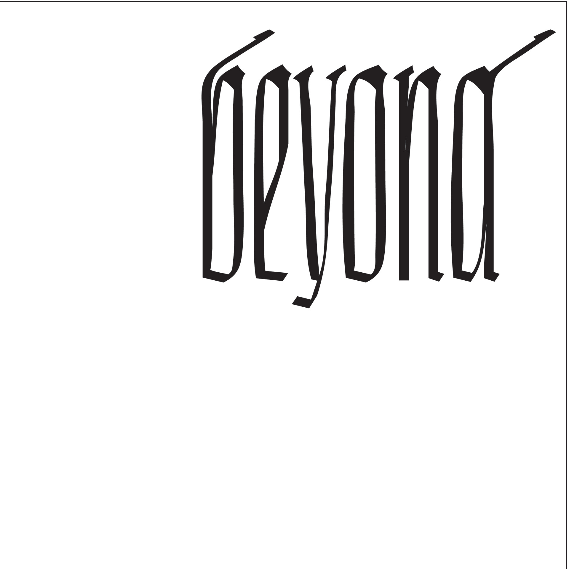

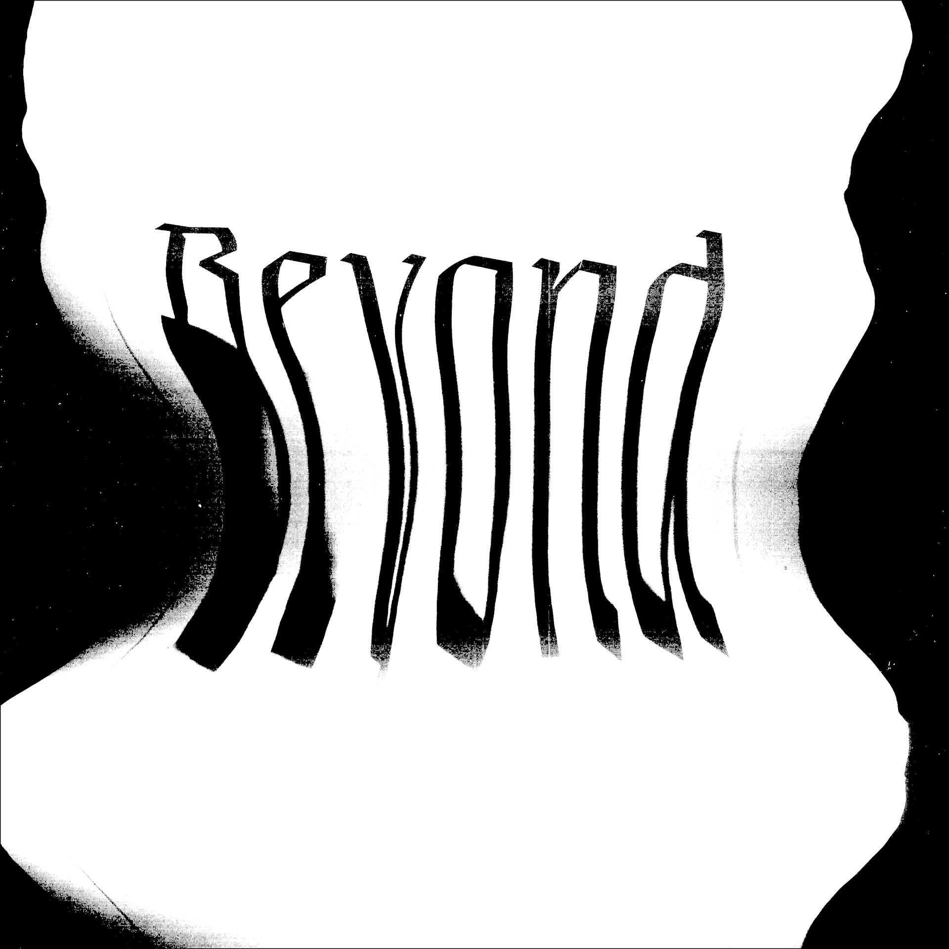
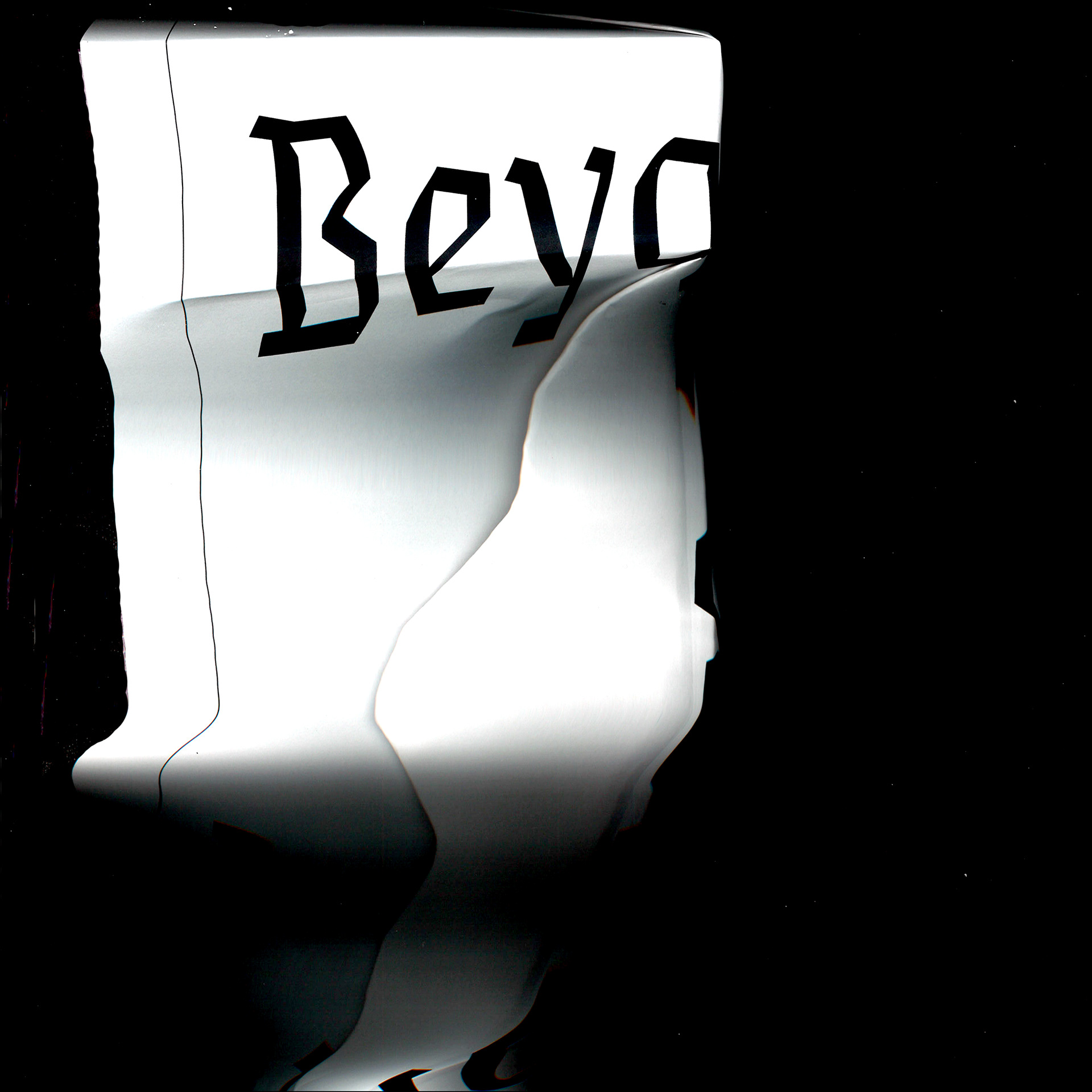
Eskapade is a font family designed by Alisa Nowak of TypeTogether, a result of years of research into Fraktur blackletter forms. Nowak stated that she wanted to create “a contemporary [font] family instead of creating a faithful revival of a historical typeface.” Eskapade Roman is descended from older humanist typefaces and is more condensed than older serifs, whereas Eskapade Fraktur is bolder than a usual regular weight typeface. Overall, Eskapade contains sixteen typefaces ranging from display to text types, from serif to heavy blackletter. The mixing of these styles helps create balance in mixed type settings. Eskapade also contains a true italics typeface (based on Cancellaresca script and influenced by Sütterlin forms) instead of just slanted uprights, as is the case with many modern Fraktur fonts.
“The Fraktur’s black weights are strident, refusing to let the white of the paper win the tug-of-war. It also won’t give away its secrets: Is it modern or historic, edgy or amicable, beguiling ornamentation or brutish presentation?”
I was drawn to this font family because of its curious dance between contemporary and historic. The strong, geometric forms seem almost industrial and indeed, this kind of modern Fraktur lettering can be seen in postmodern design, particularly brutalist design. Brutalistm first started in architecture in the late 50s-70s as part of the Modernist movement, but has seen a revival in certain postmodern graphic design communities. Known as “Web Brutalism”, this design makes a conscious effort to be what consumer websites aren’t: high abstraction, reminiscent of the early days of the internet. Web Brutalism aims to buck the trend of highly polished, user-centered analytical web designs that some designers such as Xtian Miller say limits originality and is leading to a more homogenized internet.
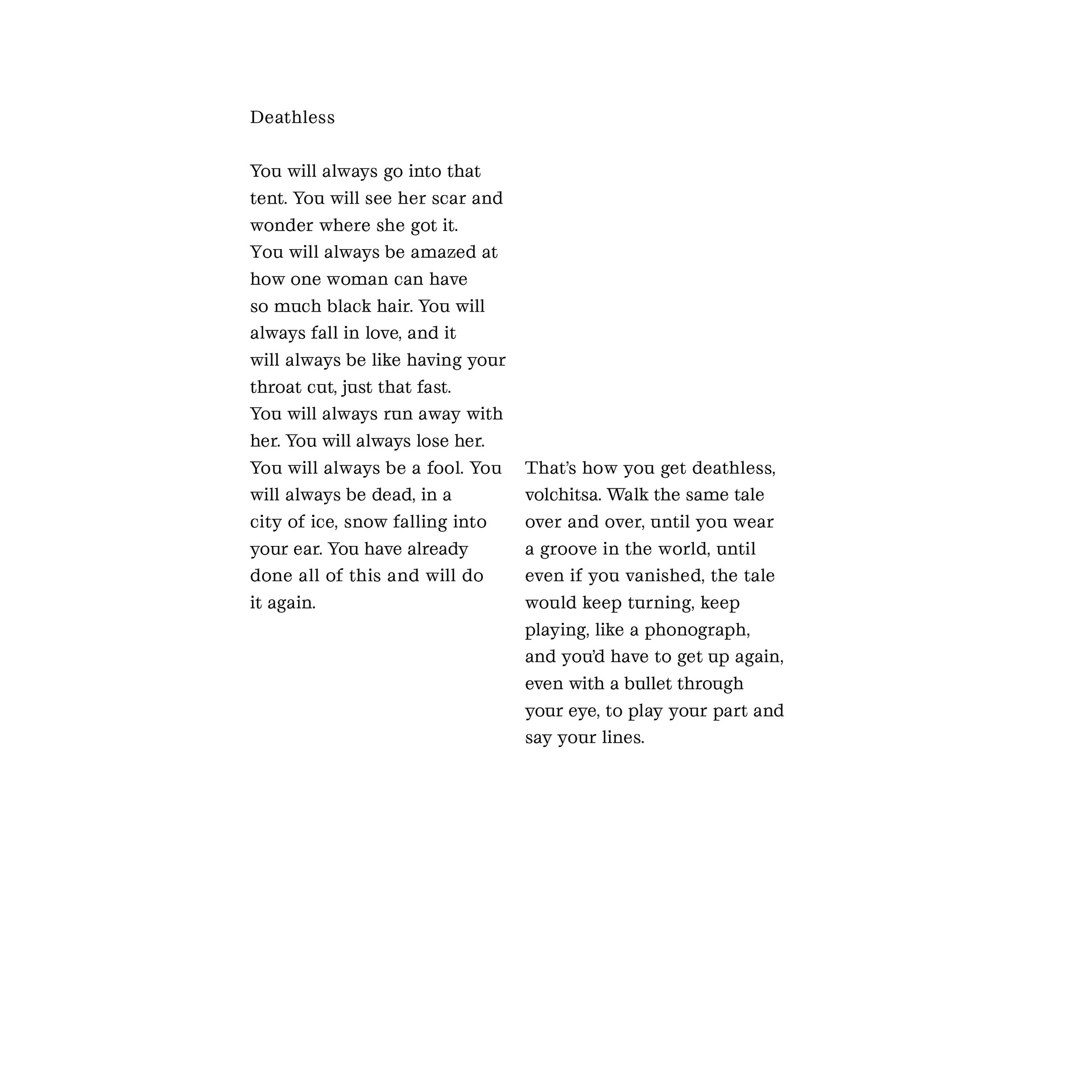


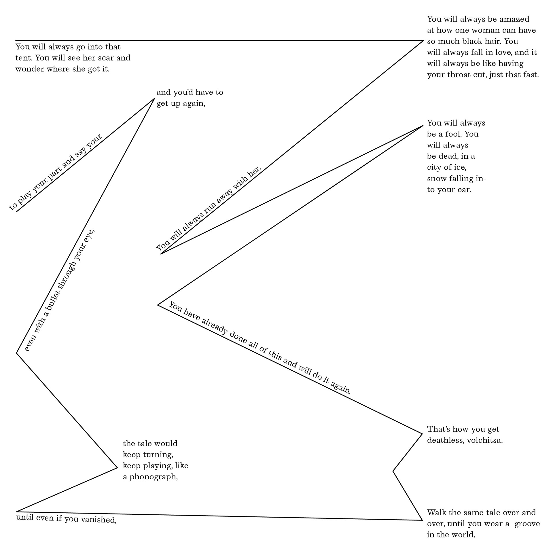
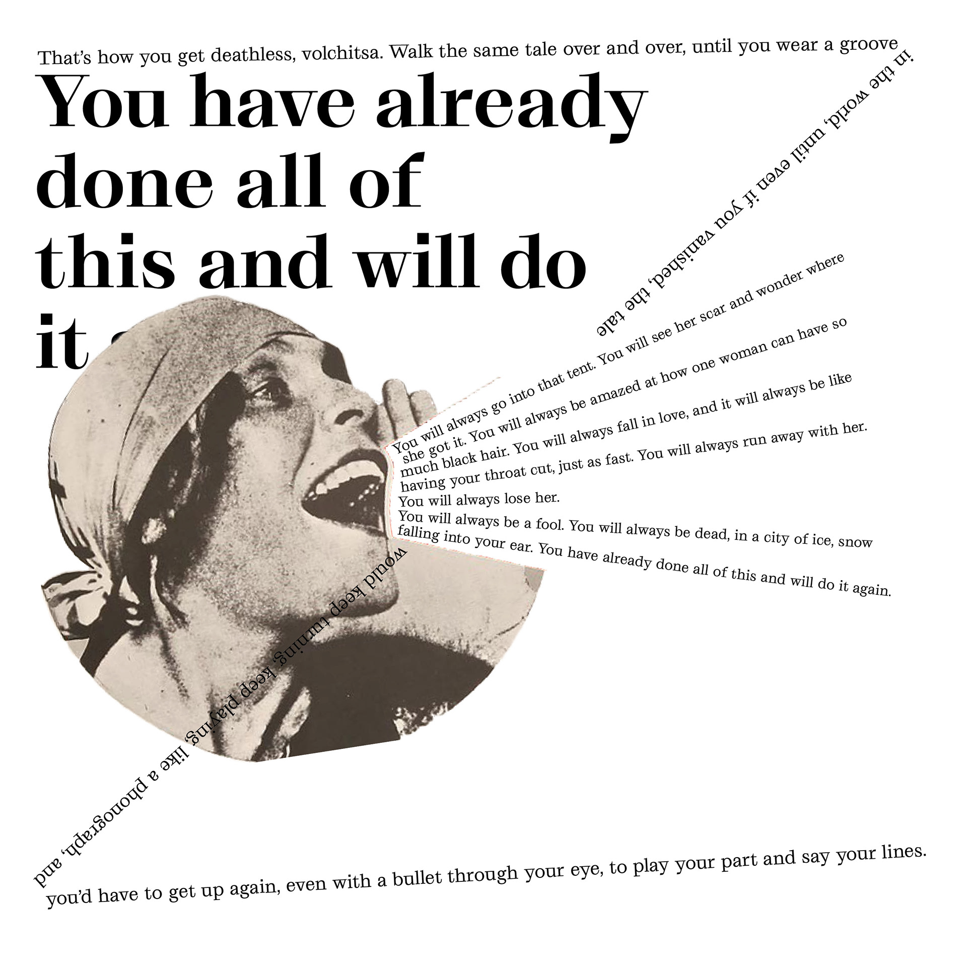
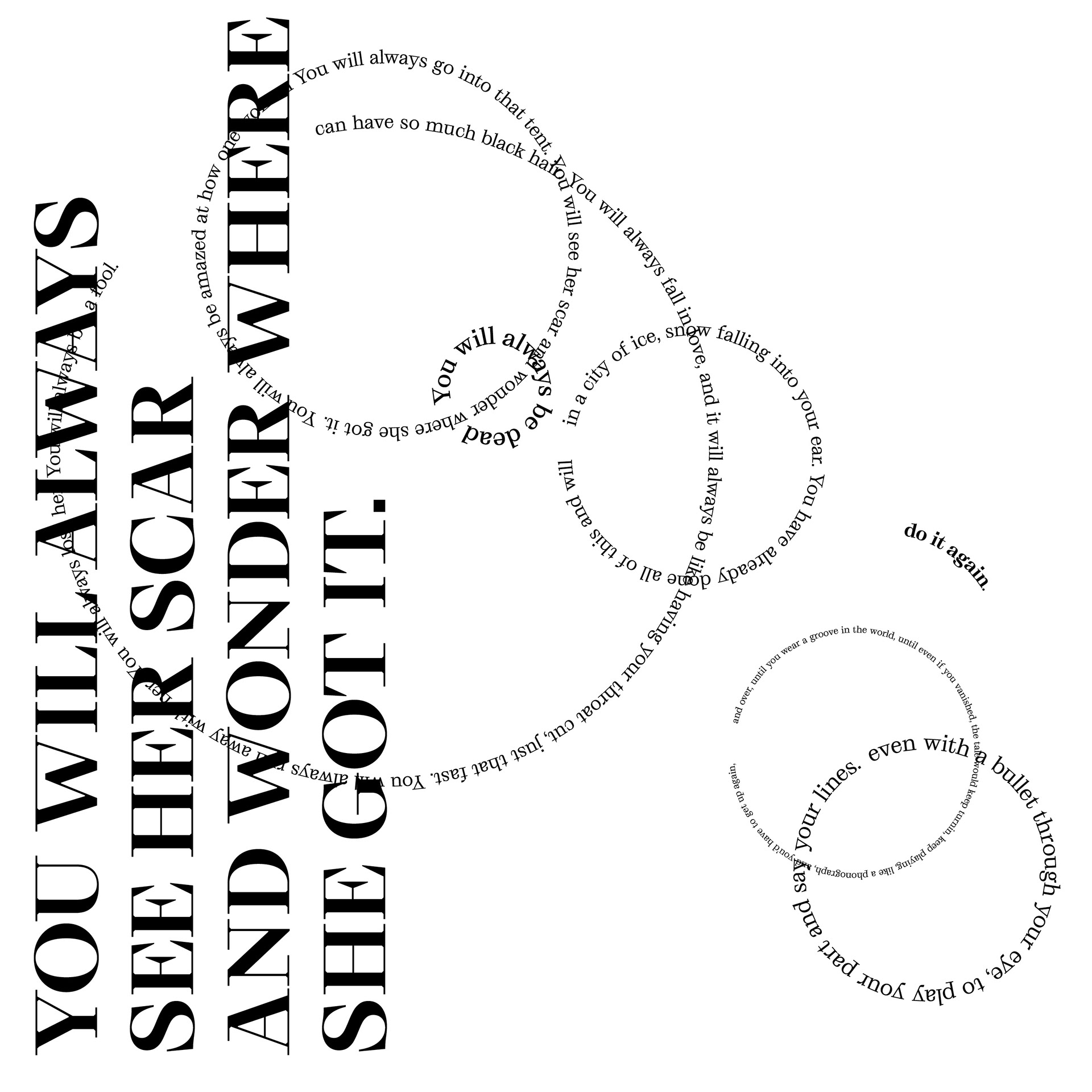
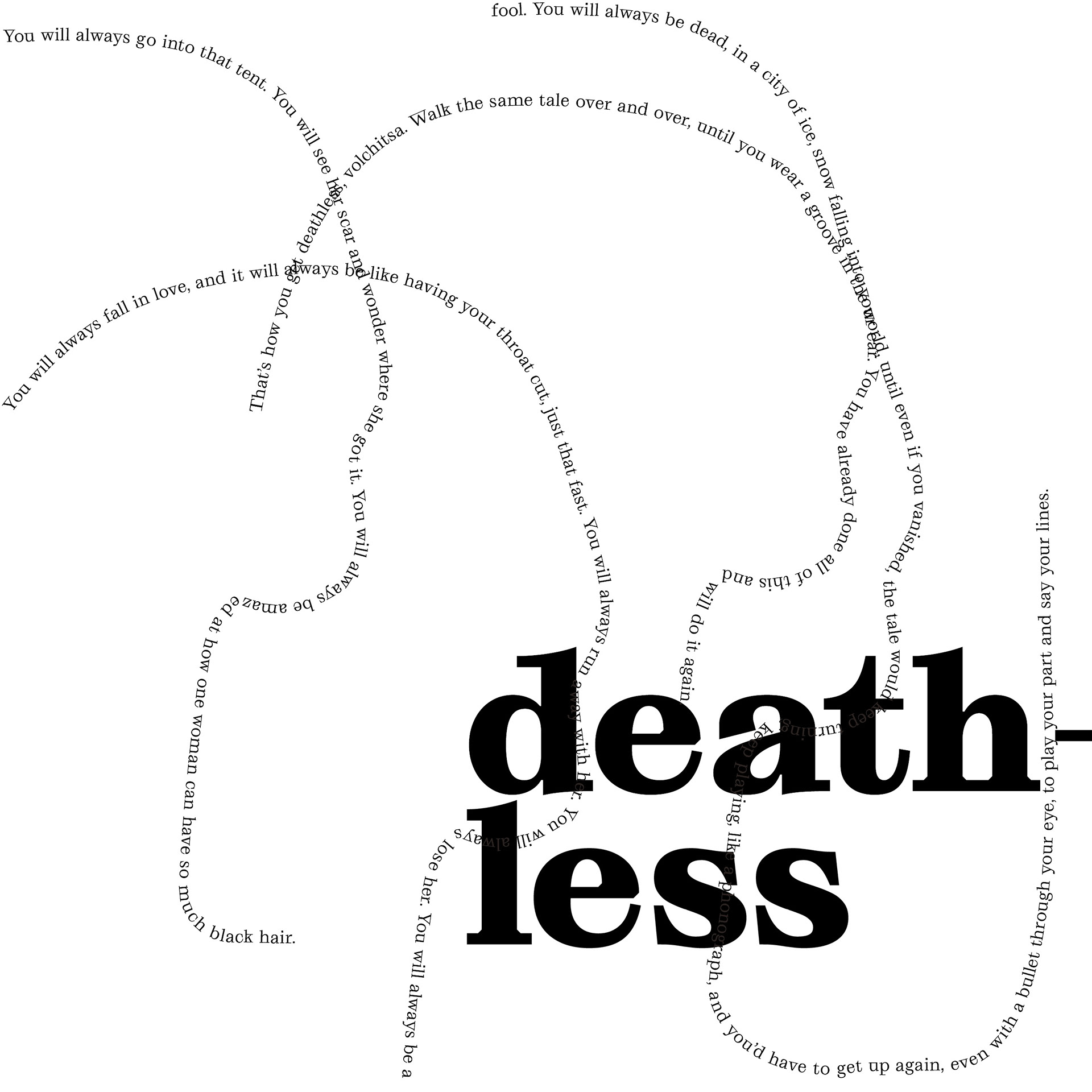
Grafier, by Pangram Pangram, is a serif typeface that comes in 5 weights (Regular to Black) and 2 optical sizes (Text and Display). This typeface is extremely versatile, as it also comes with a Variable spectrum format which allows the typographer a greater degree of control over weight and contrast. Grafier was designed as an homage to the classic serif Baskerville from the 18th century, but with a modern brutalist twist. Grafier feels like an eclectic classic type made for new media, like a cool wine aunt that gets unexpectedly popular on YouTube.